Well, well, well, look who it (finally is). It's my house transformation blog post! The third one in 5 years no less, although I think I just get better and better with age and experience as this house transformation is my favourite yet. She's got style, she's got taste, she's got a thousands-deep home pinterest board, she's got very generous worker elves who have slaved away endlessly (Mum and Dad). And now she's got a completed a house! Let's dive into some before and after photos shall we?


We'll start with the entrance hall and do this in a house tour kind of order. This was a bit of a nothing space when I first bought the house; all very neutral apart from an offensive beaded turquoise light fitting. But I wanted to make more of this space and you'll notice that as I go through, black is a big player in adding definition and finishing touches. So I mostly went black and neutral in this area. I had an aversion to white walls after living in a white-overload new build for the past 3 years so all my white-ish walls throughout the house are actually a shade called 'Summer linen' by Dulux which is the perfect off white neutral with a bit of warmth. I also had the vision from day 1 that I wanted black door frames throughout the house and did all of the outside frames, keeping the inside frames white. With the exception of this one in the entrance hall, which is actually black on both sides. The storage unit is actually a radiator cover which has a handy drawer at the top (although they delivered the same wrong item twice so I had a drama actually getting my hands on this), and then I added a pond mirror above which I think is really cool. The vase and dried bouquet are both from Shein and honestly, I've got so many amazing bits and bobs for the house from there. If you've never checked them out for home accessories then you're missing out.


The downstairs toilet started off the most outrageous shade of purple imaginable, and I had even more outrageous plans for its future. We'll call it maximalism: jungle edition. I am super happy with how this otherwise understated room turned out and it came to life exactly as I wanted! The bottom half has a little panelling and is then painted in a shade called 'The space between' by Valspar, which is like a complex night sky-esque colour; black and green and blue all at the same time. We originally bought one of those panelling kits but the planks were way too wide to achieve the right look in such a tiny room so Dad just DIY-d this with some smaller planks and it turned out perfectly.
Finding the right jungle wallpaper for the top half was surprisingly hard as I wanted something dark but with a tiny splash of pink in there somewhere and a nice mix of animals and plants. After a lot of searching though, I found a real winner. The pink kit kat tiles on the other hand, jumped out at me immediately and they were from porcelain superstore. I wanted more pink splashes than just the tiles though and I started getting served instagram ads of a company who make coloured radiators, which gave me the inspiration to paint mine. And there was some pink radiator paint leftover, so we figured it'd work on the tiled window sill too and we were right. I finished with some gold hardware (toilet roll holder, towel ring etc) and then this cool wavy mirror from Melody Maison - I've definitely got a thing for edgy shaped mirrors in the new house.


My mum has asked me a few times which room in the house I'm happiest with and while I don't necessarily have an answer (as I'm so happy with all of them), I do think that the living room has the most impact when you look at the before and after photos. The previous owners were using it as a living room and dining room combo (unnecessarily, as there is a dining room) so I changed the layout quite a lot. I decided to arrange the room with the sofa facing the large back wall, so that the back of the sofa created a bit of a separate corridor from the front door to the back two rooms.
Having had an absolute vendetta from one day against the sofa in my old house with Ollie (typical man sofa; black leather recliner which wasn't even remotely comfy), I was set on getting the most luxurious sofa that would fit in the room. This corner, chaise-longue-ish one was from the Sofa Club and I was very impressed with them; gorgeous website, super speedy delivery, very comfy sofa. If you're ever scared to buy a sofa online I would encourage you not to be, as I've always done it and it's always worked out just fine. This one was pretty reasonable too at around £1,300. Whether or not it was a risky move to choose a cream sofa? I guess we'll find out!
I was dead set on my living room colour scheme from the beginning; black, cream and mauve. This paint colour was shockingly difficult to find though as most of the colours were either too pink, too rusty, too purple, too dark or too bright. I finally found the perfect shade at Coat and it's called 'Mrs Bouquet' (Coat paint is rather expensive though so I'd avoid finding too many shades you like if I were you). So then it was black and cream everything else!
People thought I was mad when I put wardrobes in the dining room of my first house, until they realised that keeping coats near the front door actually makes a whole lot of sense and came around to the fact I'm a genius. So I did it again! This time I went with cream Ikea wardrobes (Pax) with panelled doors and the longest black handles I could find (these were super cheap on amazon). Because I'm someone who likes to use every inch of available space, I wasn't going to leave the wardrobes with a big gap next to them so I had the inspired idea to put a bookcase unit on the end, facing outwards, to round off the storage nicely. I've actually just used it as a display cabinet with lots of candles, ornaments and a rather iconic neon sign (most of these bits are shein but there's a few primark bits too and some bits I got as gifts).
Then the black and cream continued. Black lamp (amazon), black curtains (Next), black and gold light fitting (amazon), cream coffee table top with black and gold legs. The coffee table is actually a funny story as I ordered it in February from Litfad and it literally just arrived at the end of June, so I've been without one for a long time. It was worth the wait though (well, almost).
Something I've (perhaps weirdly) avoided in my other two houses was wood. I had this idea it was dated and too warm, but actually I think that's maybe where the feeling of white overload has come from, as I opted for white furniture for a long time and it lacked in warmth or texture. In this house though, it came with hardwood floors already so I was somewhat forced to embrace the wood and I'm so glad I did. I added splashes in other bits of furniture too and I'm super obsessed with the rattan look at the moment. I got a black side table with wooden top (mainly to store my wifi router but it's handy for my candle warmer and stuff too), black bookcase unit with rattan doors, and then a statement section of wood panelling with black shelves for various art prints. All of my art prints in the house are from Shein and they only cost a couple of pound each, which was a revolution as I've always wanted more artwork but it's just so expensive. I know it's not the most ethical (bad for the planet, bad for the artist etc) but I was willing to sacrifice on my morals for the house I really wanted (sorry).


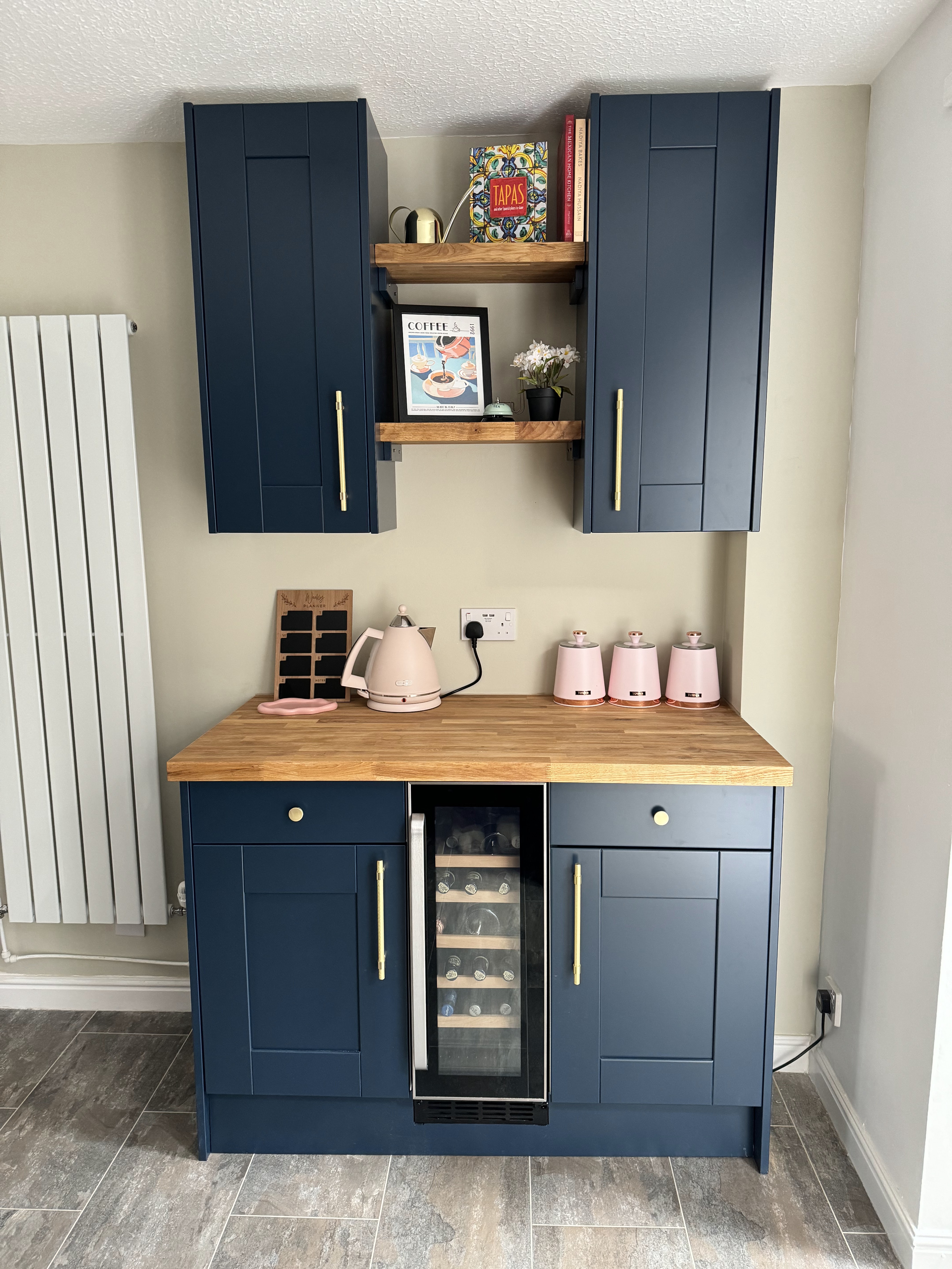
Dreams really do come true, as I've dreamed of having a navy blue kitchen for years now. Don't get me wrong, the old one wasn't exactly offensive. But it was quite dated and had a lot of wear and tear, and actually hadn't been designed that well as it wasted a lot of usable space with the wrong size units. We were originally going to see if we could reuse any of the old units but they were quite damaged so we went with a full rip-out job. The whole kitchen was designed and bought from DIY kitchens, which is very reasonable and has loads of different style choices. You can play around with all the various options in their online designer feature and I would love to say I designed it all myself. But that would be a big fat lie. You could consider my role in the makeover of the house as the visionary; the dictator; the project manager. I did not get my hands dirty one bit. All the decorating was done by mum, all the DIY'ing was done by dad, both under my watchful gaze. So it was Dad who did an absolutely amazing job in designing the kitchen and making my dreams a reality (as he so often has). I went with blue shaker cupboards, solid wood block worktops (I considered laminate to save on cost but it just didn't have the same effect), cream marble tiles, cream sink, and gold everything else, from the tap to the handles. I wanted a warm greeny beige colour on the walls and the shade 'Potters smock' by Claybrook paint ended up being the perfect choice. I also added a subtle splash of baby pink with things like the kettle, the flowers, and even the hand soap.
There were a couple of absolute triumphs in the kitchen which I think are worth shouting out. For one, we managed to find space for a whole extra bank of units (wine fridge included) by swapping a large horizontal radiator for a narrow tall one. Before, that space had been completely empty, due to the room originally being a kitchen/diner and probably used for a table (the house has been extended and would've ended at the archway before). We also had enough worktop off-cuts to create some floating shelves in the middle, as I wanted some decorative, open elements, without having too many usable things on show. I went with all open plan shelves in my first kitchen and vowed never again, as everything on them gets so filthy.
Another triumph was my idea to swap the direction of the sink. Before, it took up a lot of usable worktop space, and created a useless void in the corner. By swapping it, the corner is now perfect for drying pots, and it freed up loads of space to use for prep on the left hand side.
Possibly the thing I was happiest about though was swapping the hob. I think gas is king when it comes to cooking and I was not happy at the prospect of having to swap to induction (not least because it means replacing half your pans). It was a case of waiting until the old units had been ripped out to see if the gas was still there and could facilitate a gas hob and lo and behold, it was! The sun always shines on the righteous it seems. Even more so as I managed to get a Smeg gas hob for only £199 and then it went up to £438 the very next day and had no indication of being on sale so I think someone marked it wrong or something!


This is now my third iteration of essentially exactly the same dining room and I love it just as much as I first did. This furniture has travelled with me to all 3 houses and if I was designing my dining room from fresh again now, I'd still think teal, gold and wood was an absolute winner. The before and after photos of this room are less impactful as the previous owners used this room for their cats, so it was essentially empty. But hopefully the after photos are still pretty impressive! Again, I kept all the flooring downstairs that was already in, and the log burner makes for a nice feature, so it was about making that work in harmony with the furniture I already had.
I decided to loosely split the room into a dining area and a bar area, so I put my table and chairs towards one side, with the ottoman creating a sort of window seat, and then kept the other side for my bar cart and created a nice little breakfast bar. Because the house has been extended, it created this random open hatch area where the old kitchen window would've been. It was nothing but a sill before, but I decided to make it into more of a feature and added a length of the same worktop as the kitchen, with a slight lip, to create a breakfast bar. It's actually quite a lot higher up than you'd normally design a bar so finding stools that would be the right height was a challenge but I found the most perfect ones from amazon - I'm obsessed with the woven velvet back. As you can see, I carried the light pink splashes through from the kitchen into the dining room with the stools, the vases, the accessories. Blush pink will always have a special place in heart.
I struggled to decide what colour to paint this room. The furniture is already the main colour of the room, but I didn't want to white wash it. I wanted a real variety between rooms and I'd already gone with pink in the living room, green in the kitchen, dark upstairs. I decided I wanted a mushroom brown colour (not too dark) and it was weirdly hard to find anything like what I wanted. A lot of the browns have very pink undertones, making them feel very similar to what I already had in the living room. After buying and painting about 10 different samples (and not liking any of them), I blindly bought a farrow and ball shade called 'London stone' from the shade chart and just got Mum to paint it without a sample. It was perfect! Super happy with the colour in this room, and it matched with the tones of the flooring in a really lovely way too. The irony of course being that I planned to cover a large portion of it anyway with my gallery wall. Again, all these prints were from Shein and I just kept buying and buying them basically until I decided I had more than enough and then played around with how they'd fit on the wall. Top tip: I measured the wall and then used masking tape to create the same space on the floor. So I could lay all the prints out, play around with the composition and placement and then worry about actually getting them on the wall after that. Which I certainly didn't do in a mathematical way - I just held each one up roughly where I thought it should go based on my floor creation, marked the spot with my finger, banged a nail in, then just wiggled the frame until it was straight. No faffing around.
Of course when it comes to jobs other people are doing, I would prefer ultimate precision and care (do as I say not as I do). The archway above my bar was something I came up with fairly early on as it felt like it was a bit lost just against the white wall, and I landed on what I'd call 'peacock blue' as my choice almost straight away. That shade ended up being 'Bantry' by GoodHome and it was nothing more than Mum's beautifully steady hand that created such a perfect shape. No stencils or tape or stickers - pure skill. By this point I'd also purchased the LED sign (another shein special) and had come up with a fun little project for Dad. Basically there was already a plug socket there (not sure why so high up) but I wanted the sign to cover it. Given that it's made of clear plastic, it wouldn't cover it on its own, so I got Dad to create a raised board for it to sit on and now all the wires are hidden, the plug socket is hidden, and I'm a very happy girly.


The staircase and landing of a house wouldn't normally be worth a mention but surely you'll agree that in the case an exception is needed. Look at the transformation! There was nothing particularly wrong with the white spindle design from the before pictures - it just wasn't very inspiring. So when I saw a photo on pinterest with horizontal black beams and vertical wooden panelling, there was simply no way I could not have it. The same tradesman did everything in my house so after he'd refitted the entire bathroom and kitchen, I figured he might fancy a bit of carpentry. He did a great job on all of it and I really love the finished effect. Mum was not overly enthused about having to paint it all with 3 coats of black paint but she certainly did a great job on that too.
Something that was particularly wrong with the before picture of the stairs is the carpet! Who in their right mind would ever buy a striped brown carpet, I don't know. It was also super worn so even if it wasn't ugly, I probably would've wanted to change it anyway. I went with a cream shade almost exactly the colour of my sofa and it really felt like it brightened the whole area. It does mean I have to be extra careful if I ever fancy a glass of red wine upstairs, but we all need a little danger in our lives.
Because of my aversion to any white washing in this house, I felt like the stair area needed a little splash of colour so I decided to do a half-painted look with a little trim on top to finish it off. This colour is 'stone green' from the Dulux heritage range and while it was quite wasteful to have to buy a whole tin for such a small area, it was definitely the exact colour I wanted.
To add some colour to the hallway, I added lots of art prints, both above the stairs and in the empty section in the corner. You'll notice the wooden panelling has crept upstairs too and while this may look like a nice synergistic design choice, it was more of an "oh we have some spare from the two parts downstairs? let's stick it up somewhere". The panels are fairly expensive afterall so I wasn't about to waste half of one, and I think it adds a nice bit of something to an otherwise simple area of the house, plus it ties in nicely with all the black door frames. The plan in the fullness of time is to replace all of the internal doors with wooden ones but the bottomless pit of money has run out for now so the white ones will do in the meantime.


When I first moved in, I had in my head that doing the kitchen was priority number one. Until I used the bathroom for the first time, and it shot right to the top of the list. It wasn't that awful visually (just very nineties, which is ironic since the house was built in 2000). But functionality wise it was a nightmare. The shower screen was too small and also not sealed on the bottom, so water went absolutely everywhere. The shower was electric so not very hot or powerful, but also didn't stay up properly. It meant showering was not a fun experience! Luckily I already knew the exact vision for the bathroom and had everything picked out and ordered so it was easy enough to bump it to the top of the list.
I realised I'd never had what I'll dub a 'joy sparking' bathroom before; the last two houses have just had plain white tiles. So I really wanted something beautiful and design-led that would feel super luxurious. I decided I wanted pale blue and wood, and of course, gold. All gold everything. Including a gold shower; plumbed in, not electric. As you can see, the vision very much came to life! I'm super happy with the sink unit too as I just love the look of the bowl sat on top of the vanity with the extra tall gold tap. Of course, I ordered the largest round mirror I could find!
I have to give an extra shout out to Dad on the tiling in the bathroom. Not only did he discover these wood-effect tiles that just work perfectly (they're actually ceramic, although they have a very convincing wood aesthetic), but he also did all of the tiling. He was absolutely cursing me for demanding herringbone as it's the hardest arrangement to do, especially on a wall. But what Jenni wants, Jenni gets and there was simply no other option but herringbone in my head. And despite his moaning, he absolutely smashed it.


Obviously one of my top priorities when looking for a new house was ensuring that bedroom number two was the right size and layout for my dressing room! Funnily enough, this is almost identical in size and layout to my previous dressing room, which made it super easy to plan out where everything would fit as it's almost an exact move. This house has one fewer window in the corner than my old dressing room did, which is good as it meant the wardrobes could go the full length of the back wall (instead of going round the corner like they used to) and I ditched the central island in favour of having more space and being able to put doors on half the wardrobes.
All of the wardrobes are actually the same ones I had at Ollie's and me and mum even managed to get the two smaller ones from the dressing room in the old house, all the way to the dressing room in the new house without breaking them down. It got a bit sticky when we got them to the top of the stairs and found ourselves without a turning circle but where there's a will there's a way. And I certainly get my strong will (some may call it pigheadedness) from my momma. So alas, the wardrobes were all in!
I love the spaciousness of this room without the centre island and I've obviously kept the decor simple with just a couple of pieces of pink furniture (again, both of these have now lived in all 3 houses). This dressing room is actually ever so slightly longer than my last one, so I found myself with a tiny bit of space on either end. On the left side of the room, I converted my old bookcase into a shoe cabinet and bought these cool little inserts to stack them up and save space (they were super cheap from shein, much cheaper than on amazon). On the right side of the room, I got Dad to convert and stack three super slimline bathroom caddies into storage for all my accessories like belts, headbands and scarves. No inch of space goes to waste on my watch!


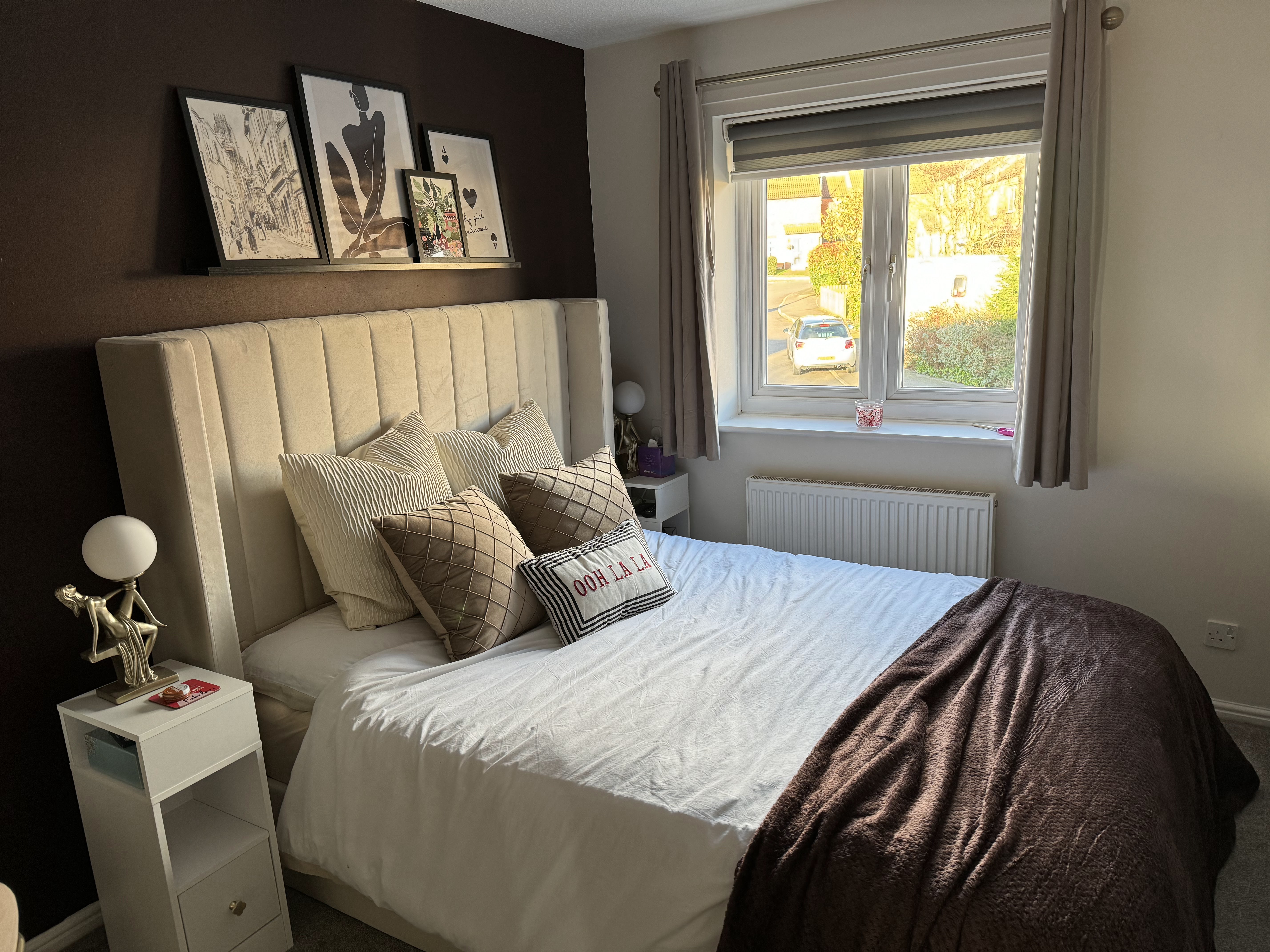
I'm a big fan of a dark and moody bedroom. I think there needs to be some darkness, and I was on the hunt for the perfect colour that sat somewhere between brown and purple. This shade is 'bitter chocolate' by Dulux trade and it is perfect; rich and dark. I was toying with the idea of doing multiple walls but stuck with just the one statement one in the end and I'm super happy with how this turned out.
I basically kept everything else quite light and neutral apart from that though. I'm super happy with the bed as it feels very luxurious and it's an ottoman one so has loads of storage space underneath too. I went with taupe as a secondary colour and bought taupe curtains and a taupe chair for my dressing table. The dressing table is super cool as it has a built in mirror which lights up!
The rest of the things to go in my bedroom were basically all the overspill things that used to live in my old dressing room so my dressing unit full of beauty stuff, my unit full of bags, and then all my makeup and perfume that used to live on the top of the two. Instead of being placed back to back to create an island, I decided to place these units on top of each other and then added a Lack unit from Ikea to hold all my perfumes and makeup and to make the most of the corner space. I was also very happy to find that the gold statue lamp I bought 5 years ago for my first house was still available, so I made it a matching set and placed one on either side of the bed on matching extra narrow bedside tables.


It was a straight swap in purpose for bedrooms 2 and 3. The previous owners had an office and a dressing room, and now I have a dressing room and an office. There was never any doubt in my mind that bedroom 2 would be my dressing room, but it did pose the challenge of what to do with bedroom 3. I ideally wanted a guest room and an office but obviously it's a pretty tiny space. But where there's a will there's a way, right? That classic pigheadedness came in handy again as I've managed to make the room do both. Instead of looking for a sofa bed which folded out in the classic way (the room wouldn't have been long enough if I wanted office furniture too), I found something called a clic clac sofa bed. It folds out sideways, so the width of the sofa is the length of the bed. I managed to find one that was almost exactly centimetre perfect for the space (of course) and then bought a super shallow desk that wouldn't take up too much space, but would allow for desk work if I wanted. This one from wilko was super cheap actually (£80) and the drawers are pretty spacious so they hold loads of notebooks and stationery, and random cables and chargers that I have no idea what they fit.
When it came to the colour scheme and decor in here, I knew I wanted wallpaper and something quite girly and kitsch. I'm obsessed with face outline stuff so obviously when I spotted this wallpaper, I knew I had to have it. The challenge then became what colour the rest of the room should be. I wanted every room to have its own identity and I was running out of colour groups, unless I wanted to go down the beige/neutral route (which I didn't). So I decided to give yellow a try. Ideally I wanted a creamy peachy colour with yellow undertones. But B&Q had limited options and I just wanted the decorating done at this point. So I took a chance on a shade called 'Buttermilk' by Dulux and while it's a lot more yellow than I'd envisioned, it's actually growing on me. I definitely think it works with the aesthetic in this room like the cool cushions. I think breaking up the yellow with some other colours is helping it grow on me too, like this blue flower bouquet (all individual stems from shein for about £1 each), and I'm considering a blue rug and some art prints on the wall. I also just need to get a desk chair and then we're done in here!


And we're basically at the end of the tour! The last place to take you being the garden. The before from the photos looks quite alright, but obviously that was taken last summer. A year of doing nothing to it meant the true 'before' photo was more like the second picture - it was a bit bedraggled and needed a bit of TLC. Luckily my team of elves are the very best and they de-weeded, jet washed and painted the fence while I was away for my birthday, and then even built up the new garden furniture they'd got me. My trusty rattan garden furniture is another thing that's travelled to all 3 houses, but I felt like a table and chair set would be nice too. I'm not really sure what to do with the slated area as it feels a bit random but I'll maybe get a firepit or something for there. The main priority though is getting a bit of life in the garden! So pots, troughs and plants are all pending. Sometimes I think I'd like some grass but then I remember it's a pain to have to cut it and I certainly don't want to take up perfectly good slabs to allow for it. So greenery via pots is going to be the way forward!
The main thing I love about the garden though? It's south facing, which means it's a perfect sun trap for worshippers like me. I'm so glad the garden (and house) is completed in time to enjoy an Aperol spritz in the sunshine. It may have felt a fairly long time since I bought the house but I'm sure you can agree it's been quite the transformation and it's been well worth the wait. If anyone would like to hire me for my interior design services then my enquiries box is open!


Comments
Post a Comment